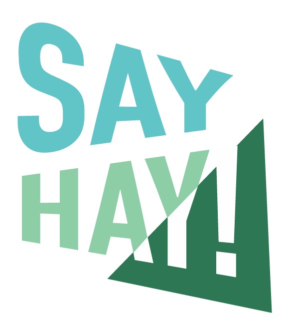
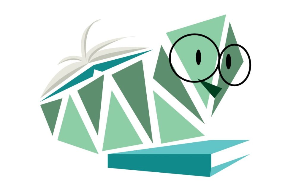
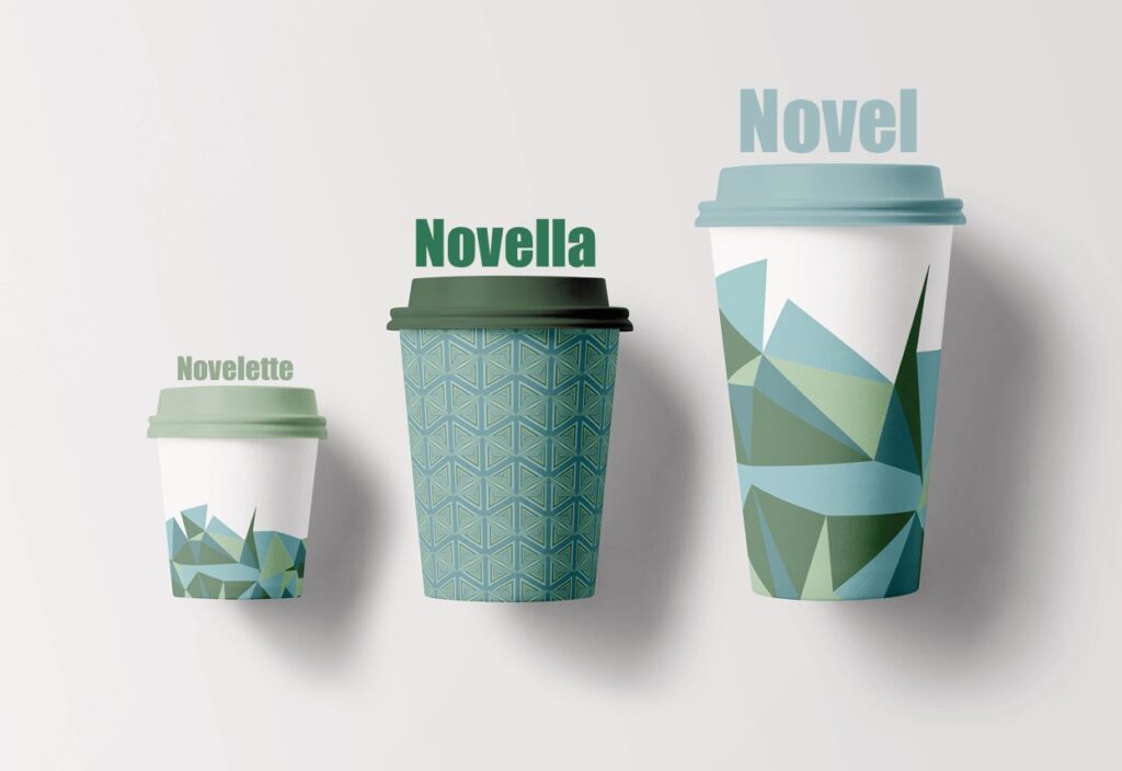
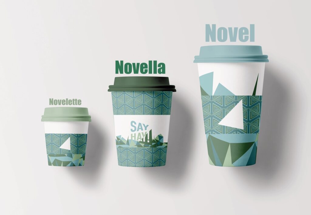
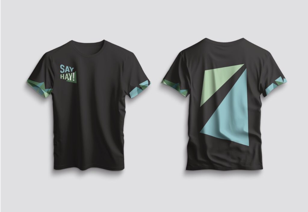
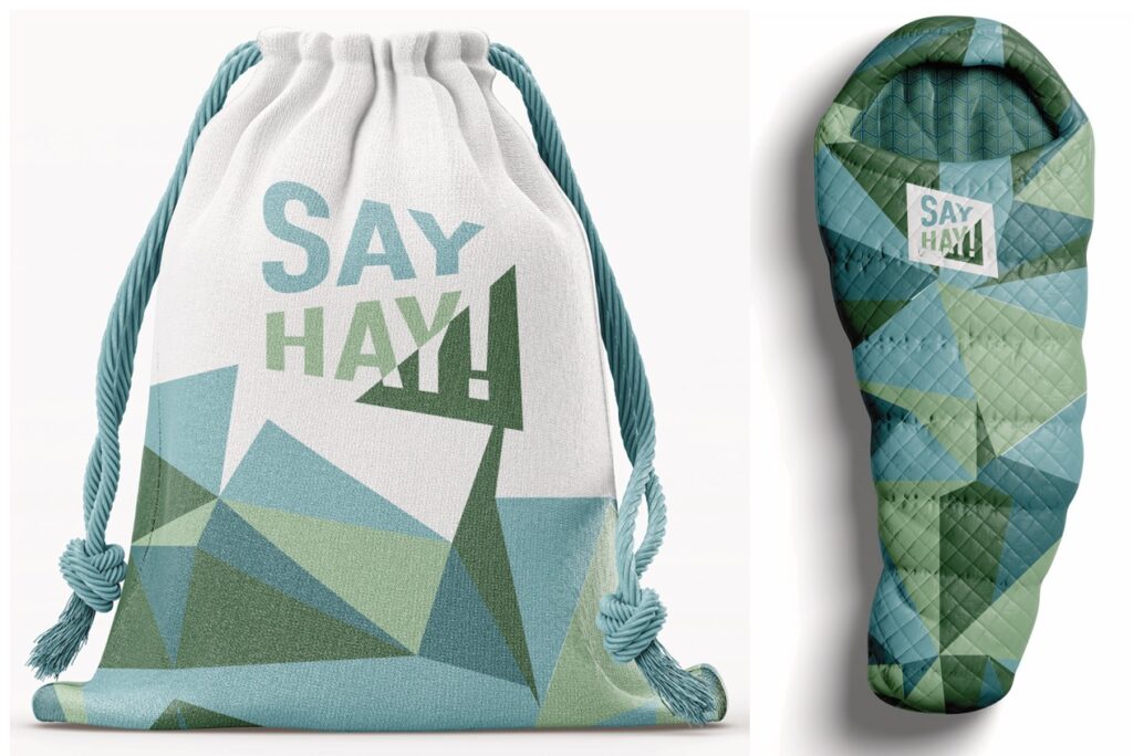
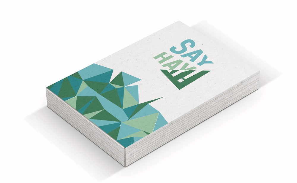
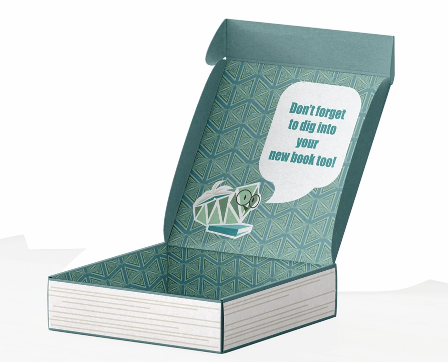
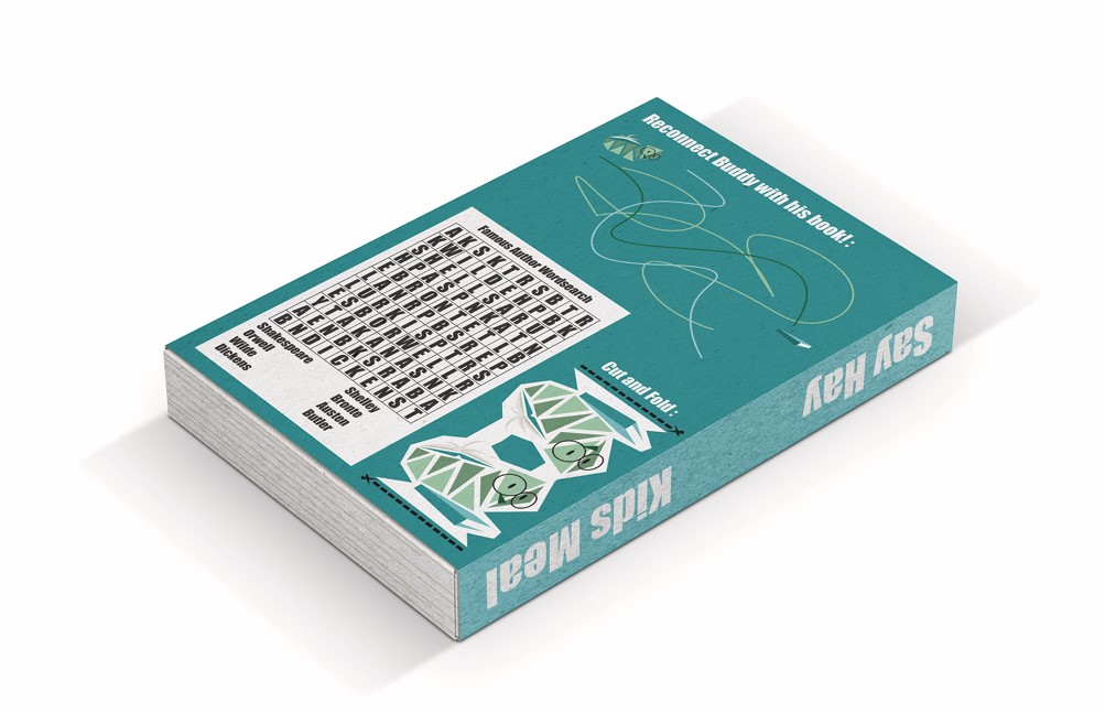
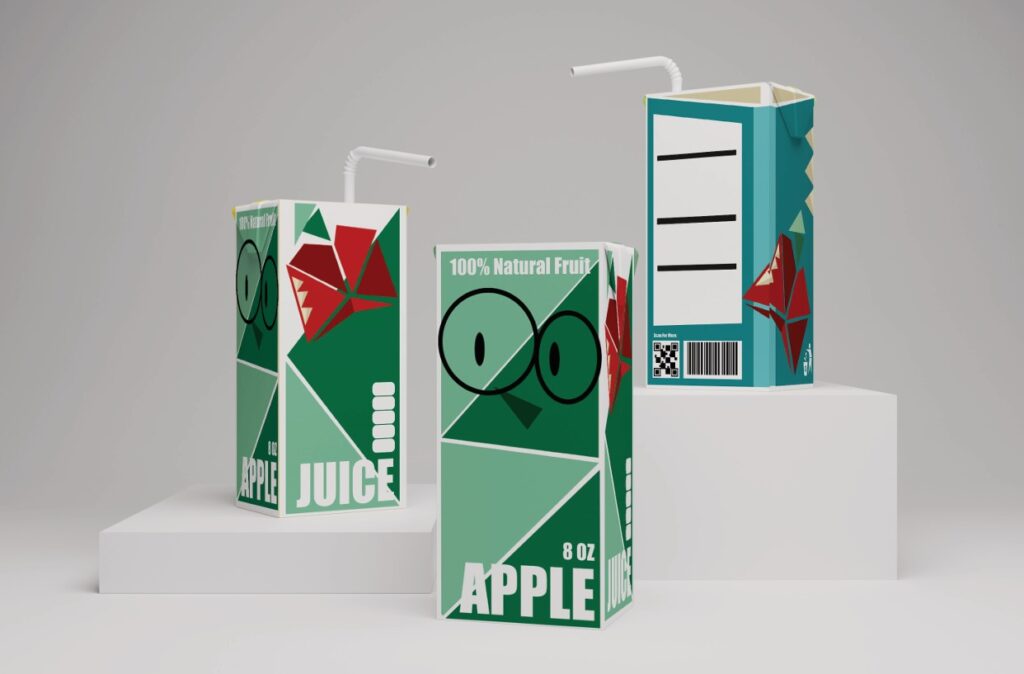
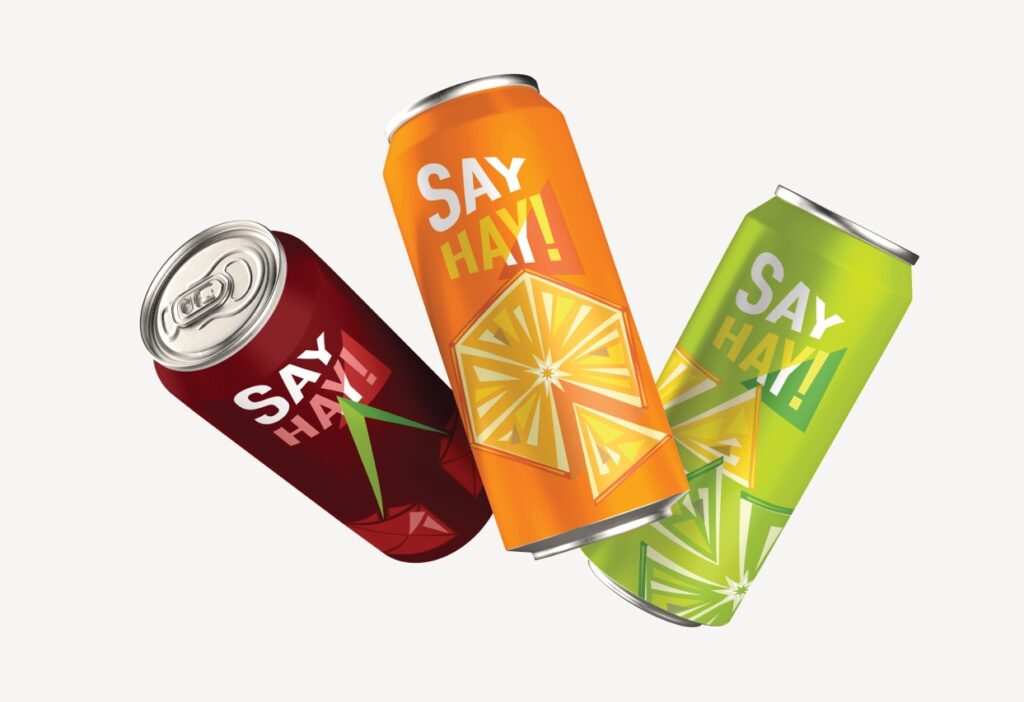
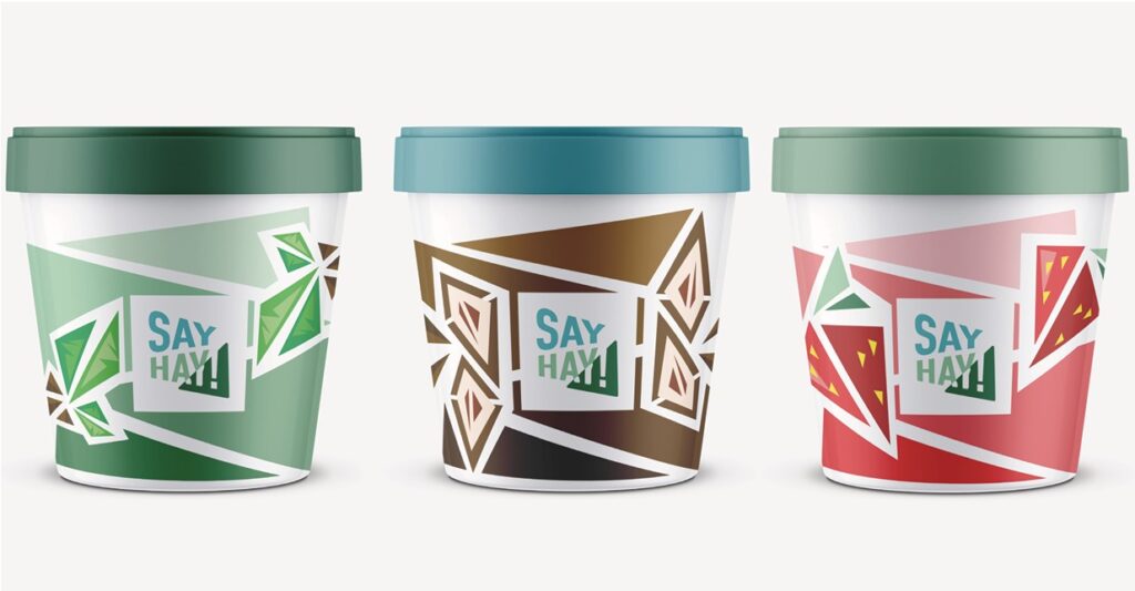
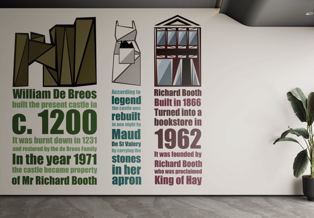
The designs are elements of a brief to design the components for a cafe in a location I resonate with. I chose Hay on Wye because of my love for the place and of books and reading. I have displayed here my designs for the Logo, Mascot, Cups, T-shirt, Sleeping bag, Kids Meal, Fizzy Drinks, Ice Cream Pots and Infographic. For this brand my logo was fairly simple with the triangle shape drawing inspiration from the bunting in Hay. Because of this as part of the brand I decided to keep a consistency of designing using triangles. It was a really fun experiment and I think it worked well, ending up with a unique and interesting brand identity. For the Infographic I used the wall and tried making it big and easy to read to increase the likelihood that people would stop and take in the information. It includes a short version of parts of the history of Hay that give the town its personality and colour so I felt that it was important to include.