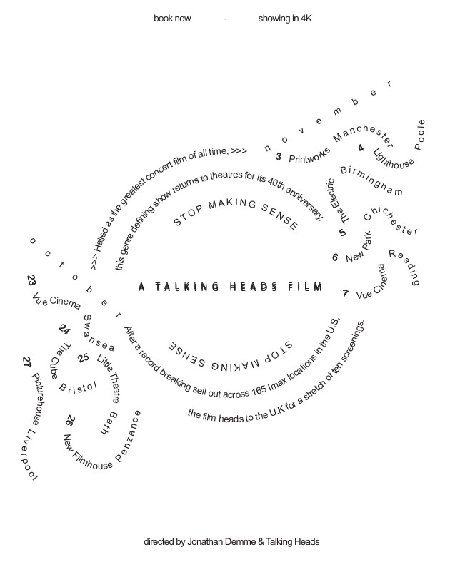
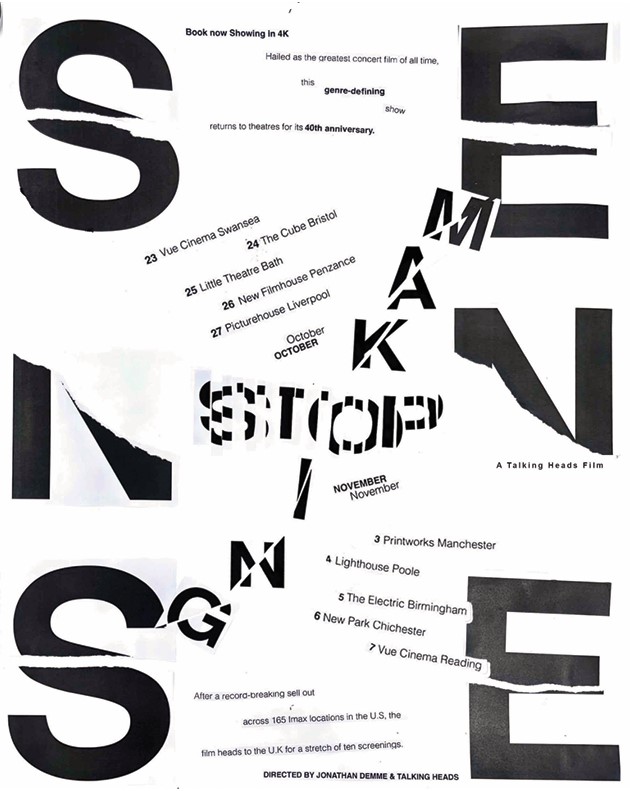
I designed these posters as part of a brief with university. The briefs were restricted in order to get us to think outside of the box. For the left design it had to all be 12pt Arial/Helvetica. Because of this I had to duplicate text to make it bold and play around with kerning and leading in order to keep some form of hierarchy. I also played around with shapes to make it more interesting. For the second brief we had a little more freedom but it still had to all be Helvetica. I worked traditionally as well as digitally, including ripped pieces of type in my design. I used the larger letters on the sides to create a subtle nod towards a film reel. I enjoy trying to create movement with design and keeping it from being too static.